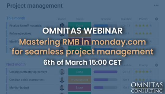
On Demand Webinars
How to visualise your data with monday.com dashboards
700 views
Join us for an exclusive webinar hosted by our enterprise business consultants, Robbie and Kuren. This session will guide you through the transformative power of visualising your data using monday.com dashboards.
During the webinar, Robbie and Kuren will demonstrate how to effectively use various visualisation tools such as pie charts, graphs, and bar charts to turn complex data into clear, actionable insights. You'll learn how to connect multiple boards to a single dashboard, allowing for a centralised view of your activities and processes. This integration is crucial for maintaining an organised and comprehensive overview that supports real-time decision-making.
The webinar is designed for anyone eager to leverage the full capabilities of monday.com. Whether you're new to monday.com or looking to deepen your expertise, you will discover strategies to enhance your data visualisation skills.
Don’t miss this opportunity to transform how you visualise and interpret your business data. Register now!
View transcript
-All right. We're live. Great. -Thanks, Robbie. So. Hi, everyone. My name is Kuren. With me, I've also got my colleague Robbie. Together, we contribute to the growth of the UK side of the business here at Omnitas Consulting. So today we're going to be discussing how to visualise your data with monday.com. So let's go straight into it. In terms of an agenda today we're going to be discussing why are visualisations needed. We're going to be going through three different scenarios. Scenario one being sales teams, then going into marketing teams, then going into our final scenario of project teams. We're also going to take a quick look at Work Canvas as well. So let's answer that question. Why are visualisations needed? It's quite an obvious question and the answers are pretty obvious as well to that. But let's just go straight into that. So the first bit is presenting bite sized information to management. So, you know, if you're looking at large quantities of data, of course it can be really hard to basically pick out what the information or what that data is actually saying. Visuals can ultimately speak a thousand words. Right? And then the second piece around this is quickly identifying, you know, which deals are at risk. So if your sales team and you're managing lots and lots of different opportunities, you might want to quickly identify, okay, which out of all those opportunities are the ones where 100 days have elapsed and maybe you need to reach out to them again. Next one gaining a top level view on all projects or events. So if you're an event manager, when are your future events you know, do you need to visualise that in a social media calendar or some kind of timeline? Do you have campaigns as well running before then? On the run up to those events that you also need to look and actually see what's going on there and which social media outlet are they being published to? The next bit is understanding who is at capacity and who isn't. So again, if you're managing a team, you know, whether you're an agency, for instance, you can see who's taking on what work, who are the people where you can allocate future work to to make sure that people aren't being overloaded. And the last one, analysing trends and taking corrective action. This is probably one of the most important ones because what's the point of having visualisations if you're not going to do anything with them when you are creating visualisations? Those are key questions to start asking yourself. Is this a visualisation that's going to give me real value to my business, and can I take corrective action from it? So scenario one sales teams over to you Robbie. So, thanks for getting us started. I just want to say to anyone who's on the call that if you have any questions, or you want to kind of put your hand up throughout today's webinar, then please do write in the questions box or the chat function. Ultimately, if you're watching this on YouTube and you want to expand on anything that we show you today, please reach out to either of us and we'd be happy to arrange a time to do that. So what Kuren was talking about, there were essentially visualising data in different ways. And the reason of doing that. We're going to start with the sales side of, of your business. So, how you can essentially use the system to visualise data, in the sales function. So what types of leads you have, for example? you can see things like aggregating the data for leads per region or the type of people that are in the businesses that you're speaking with. For example, putting a funnel chart on there will give you a good visualisation of how your leads are progressing, with your sales team. And there's a number of other views that we can use to essentially bring all of that data from your opportunities boards or your leads boards or whatever you're using monday.com for in regards to a CRM into one easily -digestible space. -Absolutely. So let's start off with this. Imagine that we've got a lead board, and our leads are now split up into three different groups. The first being new leads, qualified leads and then disqualified. Great. So let's say now that we want to start getting a few metrics around this, it's really easy to be able to create dashboards and visualisations directly into the system. All you need to do is when you're actually on a specific board, you've got tabs that you can see at the top. So if you click on this plus sign over here, I might just start off with a blank view. Blank view just allows us to then add specific widgets. So again I can go ahead and click on this button over here. And I might want to create certain chart views. So here we've got a bar chart of how many of these items opportunities belong to a certain group. And it's super easy as well for me to be able to visualise this in different ways. So I click on settings. I could change this into a pie chart and as you can see straight away, we're now brought up with different percentages. I could do the same again, by the way, if I wanted to understand. Okay, these are the total leads that I've got. What's the breakdown for the title of the people that I'm getting? So again, super easy to be able to do that. Click chart again click here, click settings. And then I probably want to change the x axis. So here we've got status. Let's put that down to title. And maybe I want to have a nice little pie chart again. So we've got roughly 43% of people of our leads being managers, 29% being directors etc., etc.. And we can start going down, the list like that. Other pieces around this is actually understanding the locale of people. So if I go back to my leads table, we can see we've got different regions of where these people actually are. So if I scroll to the to the right, we can see some people are based that in Spain some people are based out in Australia. This is really helpful. By the way, let's say your sales team and you're split up by different regions. Well it might be a nice idea as well just to get some visual representation on that so I can come in, click add widget, click on the map view. And straight away we've got this really nice kind of Google Maps view as well. So we can see all the leads like that. I can zoom in and we can see that we've got two leads in Spain, got this person based in Madrid, and I can go straight into that item itself and view all the details there. So pretty cool. -Over to you, Robbie. -Brilliant. Thanks, Kuren. It's important to remember as well, when you're building out these dashboards for you or for a member of your team, for example. Then try and explore with them or explore by yourself what sort of information, how you want to digest it. So Kuren showing us today a couple of ways that you can aggregate the data into the board. But really the best way to understand how you want to digest that is to experiment essentially with with those dashboards and with the views, you might surprise yourself with, some particular data that you want to learn from but I didn't think that you could bring into a dashboard view like that. The next one we're going to focus on is marketing teams, a huge and most one of the most popular use cases in monday.com. now, for marketing teams in particular, it's not just about bringing data that is housed in monday.com into a view so you can digest it, but having the ability to bring data from other platforms that you guys use into the system. So it does act as that one single source of truth for you. And ultimately, that might be something like your Google Analytics data and bringing that into the dashboard or bringing something like a miro board or work canvas into the dashboard and Kuren will actually touch a little bit more on that later. I do want to pause for a second and just say to anybody on the call, or on the webinar, if you do have any questions, please put your hands up. We are here to answer those for you. But again, if you do want to speak to -us afterwards, you can do that as well. -Great. So if we are to start off then with, with the marketing use case. so very often creative teams, they've got lots of different files that they're dealing with. So one obvious one to then click into is we've got something called a files view. So if I click on explore more views. And here we've got a file gallery. So we can see all of the different files with their thumbnails uploaded directly into the actual system itself. There are a bunch of other views as well that you can start adding around this. So let's say you've got a board with creative requests. So again this could be creative requests coming internally. So you might have like an intake form which people are filling out. And once they fill in this form and hit submit this is then populating a new line item into this new request table. An easy way of being able to review the results of that is by going into what we call the form viewer. And very easily you can see all the different answers that people have done. There are a bunch of other views as well that you can start looking at within monday.com. You know you can use as well as Kanban being useful for sales teams. This is also quite useful as well for marketing teams. In this case, this is just the status which or the department, sorry, which each item falls under. And then you can easily move and drag different items to their respective teams. there's other pieces as well of this. So if I go into the onboarding plan, we've got lots of different items and lots of different sort of timelines associated with those. We might want to start getting some timelines around this and some visualisations to be able to look at this from a holistic point of view. So if I click on this plus sign over here, click on explore more views. I could type in timeline. And straight away we've got this image over here. It's not looking that colourful. So what I might do is click on these three dots clicking settings. and then I might want to group it by I want to group it by the group. Right. So we can see okay what's in phase one, what's in 2.0 and what's in 2.1. Let's have a look at the other settings as well. You can even do like a group summary which is pretty cool. So you can actually see when is phase one starting and when is it ending. Same thing for 2.0. Same thing for 2.1. And then you can also colour it as well. So we can colour it by the status at which it is at. Again super important to look at multiple different pieces of information, all in a single graph, all in a way that's super, super easy to digest. There's other views as well that you can add around this. So we could start looking at calendar views as well. So I'm just going to type in calendar click Add Widget over here. And again a really really simple way just to view what's going on in a really nice view which your team can understand. -Perfect. -So the idea really guys is to try and create that one stop shop for you. Whether you look at it on a weekly basis or a daily basis, but to really understand whether you're in sales or project management or marketing or you're part of the C-suite to really understand where, things are at in the organisation. Ultimately, monday.com can house a lot of operations. it can house a lot of use cases. So even if you wanted to bring in, data from a project board and a marketing board and a sales board all into one view that's still available to do, we can jump on a call and show you if you want to look at that as well. But we're not going to cover that off today. What we're going to move into next is, basically the similar thing, but for project teams. So looking at things like resource allocation, building, portfolio dashboards. So all of the live projects that you have and how we're able to track them, budgets, timelines, this sort of thing as well. And even if depending on the methodology, obviously, that you follow, but trying to build that into a, an easy to digest a view for you or your teams or your senior leadership. So I'm going to hand back over to Kuren, and he's going to jump into how you could use this in project -management. -Yeah. So this is this is really, really cool. So imagine you've got three stages at which projects come in at. So they come in at the planning stage then goes into execution then goes into closure itself. Again you can do what I did before, right? You can add simple bar charts and graphs around this. Or I could might start off with a blank view. I might add the widget over here. I might then come into this particular chart itself. And again I can see the different stages which projects are at. There's other things as well that I might want to do. So I might just label this. So stage of project. And actually this is labelled by the actual status. So I can come in. Let me just do that again. Stage of projects. Perfect. And then I might want to actually just relabel this. So instead of the x axis referring to the status, maybe I want that to refer to the actual group. It's worth noting as well, guys, that all of this is interactive. So it's not just like a static bar chart that you're very used to when you look at tools like Excel. I could click into this and I could say, what are all the projects or items which are closed out? Click into that or what? All the ones at the planning stage, I could click into that Something that's actually quite interesting about this graph is it looks like it's the wrong way around. So let's go ahead and try and fix that. I can come in, go on the settings and let's see if we can. Here we go. So we can do x axis. Let's try that. So there we go. We've got it switched over. We've got all the information at the bottom. Really really easy to be able to look at other pieces that also sit around. This is we can look at a Gantt chart as well. Again, this is just a view to be able to say where each item is at. So I can check at the planning stage. And we can also see that dependencies have been built. That's what these arrows represent. Okay. And the way that this is working is it's pulling in information from the dependent fields that we filled in here. So we can see. Kick-Off is dependent on research, for instance. And that's why we've got these arrows connected, which is really nice with this as well is if we drag things across, as you can see it doesn't change there. But as soon as I start trying to overlap with the next item, it then pushes the other one across. That's where the dependencies are coming into place. This is a really nice view as well. Especially for organisations who are working with a critical path methodology. So every organisation which effectively has a deadline is going to be working in a critical path methodology because they've got a timeline that they're working towards. And so for them they need to understand what are the critical items or tasks that need to be completed. Because if they're not, that would then critically affect the actual deadline itself. So companies really find this important so that they're working on the right things at the right time, but also making sure as well that they're keeping to things like budget as well. There's other pieces as well that we can start adding around this so we can do things like number views. So I can click on this plus sign here, or we've got blank view already there. And I click add widget and I click Add Numbers. So let's look back at this main table. We've got the cost column over here. Maybe we just want to do a big sum of that and say what's the total cost for all of these line items. So I could come in here I could click on settings and we could say the cost view. Take that off, add some view. And then here we've got different units. So in our example this was listed in US dollars. So I'm just going to put this as a as a dollar sign. Again you can do things like averages as well. You can play around with this. But here we're just going to keep it to the sum okay. So maybe I just want to rename that and call that total cost. Simple. Other pieces as well that sit around this is maybe looking at resource allocation as well. so we've got here, you know, I've just put my face, I've just allocated myself to these different items. But what we can then start doing is we can start saying. Who's got what's on their plate. So if I go into here click on add widget. Click on more widgets. And then I click on workload. Let's give this a second to load Straight away we can see what's been unassigned and what's been basically assigned to myself. Let's go ahead and play around with the settings as well around this to see what's going on here. So it looks like it's based on here we go. Count items. So it's measured by the number of items that's been assigned to me. So one item assigned to me two items which in this particular week two items which are unassigned, etc. We could also base this on the number on the amount of effort as well. So here we can see I'm putting in five hours of effort in this particular week. Maybe I want to also play around with this and actually set a weekly capacity. Maybe my weekly capacity is only four hours a week. Straight away we can see things highlighted in red. Now imagine this being listed out for your whole entire team. It's then very easy to see who's at capacity, who can be allocated what. Maybe work actually needs to be shifted from one person to the next. So it's certainly recommend playing around with this view as well. And then you can keep going as well with the number of visualisations that you add around this. So I'm just going to show you something which is a little bit more built out. So again you've got things like number of projects per stage. Again all of this is doable. And you can go deeper into this. You can see okay all the projects which are on track etc. which are actually on a critical path. So that could be really interesting. I can click onto that. And we could see okay. So this item itself is very important to the project completing. And you've got a bunch as well of other visualisations as well that we can start drilling into. Right over to yourself. -Robbie. -Robbie, are you still there? -Yeah. -I'm here. I'm waving my hands around, but I'm not saying anything. Yeah, I was muted. I was just saying basically that the the views and everything that Kuren is showing us, everyone and how to set these dashboards up is really to aid, time saving. We spend hours and hours a week trying to aggregate information for our meetings with our managers, or for meetings with clients or prospects. A lot of what we do in our day to day or in our week is trying to get information from whether that's from different teams, different departments, different individuals in your organisation or in your team. and what this will allow you to do is create a real, live, active view of all of that data you're trying to aggregate each week in one easily managed dashboard. So try and use them to save you time, not just for the sake of building out a dashboard, because otherwise it would be irrelevant. But try and use that in the organisation as a time saving technique. The next thing we're going to roll into is monday.com new products. So, this is Work Canvas, if you haven't seen it already. We're not just going to show you one slide on that. So it's going to expand on it in just a moment. outside of what Kuren shows you today, if you're using anything like Miro or any of those sort of platforms, there's a whiteboard, a digital whiteboard, then ultimately monday.com should be your replacement for them, because if you're using monday.com, you essentially should be using monday.com work canvas because they talk together very, very well. So you'll learn a little bit more with Kuren just now. But if you do want to learn more about Work Canvas and how you can use it as an organisation, it's a separate conversation to this. Please reach out to me or Kuren on LinkedIn or drop us an email, whatever you're comfortable with, and we'll be -more than happy to show you through that. -Absolutely. So as Robbie mentioned, work canvas, this is monday.com digital whiteboard or Digital canvas tool for everyone to use. Ultimately, everything that you can do on a whiteboard, you can do directly onto this. It's a super easy tool, super easy platform to be able to use. So if you want to get started, just click on New Canvas. Let's give this a couple of seconds to load. And then you're presented with a bunch of different templates that you can start going into. So you can go project management templates, a critical part, something which we talked about. You've got agile scrum boards, kanbans, we can look at HR's roles of departments, etc. so I could start building for instance an org chart, click on use template and boom, there we go. We can place things like that. It's really easy to be able to actually edit things as well. So, you know, if I fancied myself as the CEO of the organisation, I could put myself there, of course. And then we can also put together other people as well here at the bottom. And it's it's quite an intuitive interface. Ultimately, you know, if you want to add a person left to this person, then we can add that person. Then if you want to add them to the bottom, you can add them like that. Really easy to be able to use this. the second piece is well around this is all of this, by the way, integrates two ways to monday.com. It's almost like a two way sync. So as an example, if I said, I don't know, let's say I added a sticky note, which is what I clicked on on the left hand side and I typed in project one do task as an example. We can right click this. And here we've got Create monday.com item I can click into that. And I could say create item create sub item. So the whole core of this is that we've got both of those systems already talking to each other. So if you're already using separate tools to be able to do this like a Miro. Why not just do everything together? Using what? Canvas and monday.com. As mentioned as well. It goes both ways. So if I go back to one of my boards over here, and let's say I wanted to bring in some of this canvas information directly into this, it's really easy to be able to do that. So I can click Add widget. more widgets and I could type in embed everything. Add this widget over here. And as you can see we can then begin to add this particular site. So I might want to copy that link. Put that link there. Great. Now we've got the information pulling over and we can start adding more information as well. And we should then see that information also represented here. So it's a two way thing. Really really interesting stuff. Robbie do we have any questions in the chat or anything like that. No. Quite audience this one. But guys, if you do have any questions for us, anything we've shown you today if you're watching this back on YouTube, like I mentioned, reach out to us on LinkedIn or drop us an email, whatever you're comfortable with. We will be more than happy to support you with creating a dashboard or new views for your business to benefit from. Guys, thanks so much for joining us. That is the end of the webinar. and Kuren, thanks so much for diving into the system with us today. some really, really useful tips and information there that hopefully everybody can take away and start implementing in their own monday.com system. Awesome. Thanks very much, guys. If you've got any questions. We've also got links as well on our LinkedIn's as well for, for you guys to contact us. So let us know. Otherwise. Thank you so much for -your time today. Thank you. Brilliant. -Cheers.